Introduction
Did you know that 80% of young audiences prefer videos with subtitles? Subtitles are no longer just a tool for the hearing impaired; they have become essential for capturing viewers' attention who watch videos in noisy environments or in silence. However, not all subtitle fonts are created equal.
Choosing the right subtitle font can make your content more engaging and easier to understand. In this blog post, we'll explore the 10 best subtitle fonts that can enhance your videos, making them more appealing and accessible to your audience. Whether you're creating content for YouTube, social media, or corporate presentations, these fonts will ensure your subtitles are clear and stylish.
Why Subtitle Fonts Matter
The Importance of Readability
Subtitle fonts play a crucial role in how viewers interact with your videos. With 80% of young audiences preferring videos with subtitles, choosing fonts that enhance readability is essential. Clear and legible subtitle font conveys your message effectively, even in noisy or silent environments.
Impact on Engagement
Good subtitle fonts do more than convey words—they keep your audience engaged. When subtitles are easy to read, viewers are likelier to stay focused on your content, which can lead to higher viewer retention and better engagement with your videos.
What to Look for in a Subtitle Font
When choosing a subtitle font, consider the following factors:
Readability: Ensure the font is easily read at various sizes and on different devices.
Simplicity: Avoid overly stylized fonts that can distract from your content.
Compatibility: Choose fonts that work well across multiple platforms and screen sizes.
Focusing on these criteria can help you select subtitle fonts that look great and enhance your audience's viewing experience.
Top 10 Subtitle Fonts for Clear and Engaging Videos
Choosing the right subtitle font can significantly affect how your content is received. Here are the top 10 subtitle fonts to enhance readability and viewer engagement.
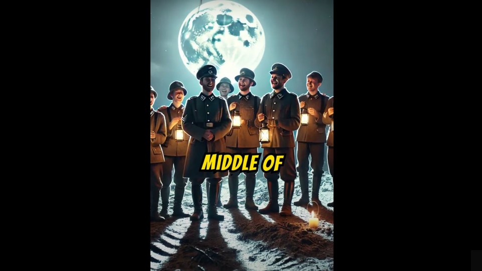
1. Komika Axis (MrBeast Font)
Overview: Popularized by MrBeast, Komika Axis is known for its bold, eye-catching design. It stands out without being overly flashy, making it perfect for dynamic and energetic content.
Best Use: Ideal for high-energy videos, gaming content, and attention-grabbing thumbnails.

2. The Bold Font (Alex Hormozi Font)
Overview: Used by Alex Hormozi, The Bold Font is recognized for its strong and confident appearance. It's straightforward yet impactful, making it suitable for serious and motivational content.
Best Use: Business presentations, motivational videos, and formal content.

3. Bangers (Best for Short Form Content)
Overview: Bangers is a lively and playful font, making it a great choice for short and engaging content. Its bold and animated style captures attention quickly.
Best Use: Social media videos, short clips, and informal content.
4. Averia Libre
Overview: Known for its subtle and elegant style, Averia Libre combines readability with a modern look. It's a versatile font that works well in formal and creative contexts.
Best Use: Educational videos, vlogs, and aesthetic content.

5. Roboto
Overview: Roboto is a modern, clean, and highly legible font designed by Google. Its neutral and friendly appearance makes it a versatile choice for various types of content.
Best Use: Explainer videos, tech content, and professional presentations.

6. Gotham
Overview: Gotham is a sans-serif font recognized for its clean, elegant appearance. Its distinctive style and wide range of weights make it suitable for a variety of video content.
Best Use: Ideal for corporate videos, branding content, and projects requiring a polished and professional look.

7. Futura
Overview: Futura is a versatile sans-serif subtitle font known for its modern and geometric design. Its clean lines and balanced proportions make it a popular choice.
Best Use: Suitable for minimalist and contemporary video styles, as well as professional presentations.
8. Helvetica
Overview: Helvetica is a classic font known for its clean, straightforward design. Its neutral appearance and high readability make it a favorite among designers and content creators.
Best Use: Corporate videos, documentaries, and formal presentations.

9. Verdana
Overview: Verdana is a widely used sans-serif font designed specifically for screen readability. Its large x-height and wide letter spacing make subtitles easy to read on any device.
Best Use: Technology videos, explainer content, and any video requiring clear, legible subtitles.

10. Montserrat
Overview: Montserrat offers a modern, clean design with distinctive characters. Its slightly rounded letters give it a friendly and approachable feel, making it suitable for various video styles.
Best Use: Creative projects, vlogs, and contemporary content.

Top 10 Subtitle Fonts in a Nutshell
To recap, here are the top 10 subtitle fonts that can enhance your video content:
Komika Axis - Great for high-energy content.
The Bold Font - Ideal for motivational and business videos.
Bangers - Perfect for short, engaging clips.
Averia Libre - Versatile for formal and creative content.
Roboto - Modern and neutral, suitable for various types of videos.
Gotham - Clear and highly readable for instructional content.
Futura - Clean and professional, great for corporate use.
Helvetica - Classic and neutral, ideal for formal presentations.
Verdana - Screen-friendly and highly legible for tech videos.
Montserrat - Modern and friendly, perfect for YouTube shorts.
Choosing any of these fonts will enhance your video's readability and engagement, ensuring your content stands out and retains viewer attention. In the next section, we'll share practical tips for effectively implementing these fonts in your videos.
Criteria for Choosing the Best Subtitle Fonts
1. Ensuring Readability
Readability is the cornerstone of effective subtitles. A good subtitle font should be:
Clear and Legible: Fonts should be easily read in various sizes, especially on smaller screens like smartphones.
Uniform Stroke Widths: Consistent stroke widths make the text appear cleaner and more readable.
2. Importance of Simplicity
Simple subtitle fonts are often the best. Here's why:
Avoid Distractions: Overly stylized or decorative fonts can distract viewers from the video content.
Focus on Content: Simple fonts help keep the viewer's focus on what's being said rather than the appearance of the text.
3. Compatibility Across Devices and Platforms
A versatile font ensures your subtitles look great no matter where they're viewed:
Cross-Device Compatibility: The font should look good on TVs, computers, tablets, and smartphones.
Platform Agnostic: Whether your video is on YouTube, social media, or your website, the font should maintain its readability and appeal.
4. Optimal Font Size and Spacing
Correct sizing and spacing are essential for subtitle fonts:
Font Size: Large enough to read comfortably but small enough not to obscure the video.
Line Spacing: Adequate spacing between lines to avoid a cramped look and improve readability.
5. Choosing the Right Color and Contrast
Colors and contrast can significantly impact subtitle readability:
High Contrast: Ensure the font color contrasts well with the background. White or yellow text on dark backgrounds works well.
Avoid Busy Backgrounds: Place subtitles on solid or blurred areas to maintain readability.
Consider these criteria to choose a subtitle font that enhances your video's accessibility and viewing experience. In the next section, we'll reveal the top 10 subtitle fonts that meet these criteria and are perfect for any type of content.
Final Words
Choosing the right subtitle font can significantly enhance the viewing experience, making your content more engaging and accessible. With 80% of young audiences preferring videos with subtitles, selecting clear, legible, and visually appealing fonts is crucial.
Follow the practical tips for implementing these fonts to ensure your subtitles are readable. Remember, the right subtitle font can make a difference in how your audience engages with your content. Happy subtitling!