image model · by Meta
Meta Muse AI Image Generator
Generate and edit images with Muse Image, the first image model from Meta Superintelligence Labs, launched on July 7, 2026. Meta built it to follow instructions faithfully, edit with precision and compose from multiple references, and it renders text cleanly enough for how-to guides and infographics. On Fliki it accepts up to 10 reference images and costs fewer credits than most premium models. Available on Fliki paid plans.
Generated with Meta Muse
A handful of Meta Muse samples generated inside Fliki. No edits, no post.
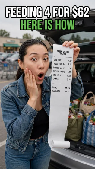
Prompt
SCENE: The first frame of a TikTok budgeting video. A young mom in a grocery store parking lot in suburban Ohio holds up a long paper receipt to the camera with a playful shocked face. The receipt is the proof, so its printed text must be sharp and exact. FRAME: Vertical 9:16 phone frame. Keep the face, product and headline inside the middle two thirds. Leave the top eighth and the bottom fifth free of critical detail, because app interface and captions sit there. Favor vertical depth: foreground, subject, background stacked top to bottom. SUBJECT: A 30 year old Korean American woman with a sleek low ponytail, small gold hoops, a cropped denim jacket over a black ribbed tank. She stands beside the open trunk of a silver minivan full of reusable grocery bags. Her right hand holds the receipt up beside her face, the paper unspooling down past her waist and curling at the end. Her left hand is on her cheek. Mouth in a round surprised "o", eyes wide, looking straight into the lens. RECEIPT TEXT: Thermal paper receipt with a faint grey tint, printed in a monospace receipt font, black ink, left aligned with prices right aligned. Top center: "FRESH VALLEY MARKET". Then item lines: "EGGS 18CT 4.29", "WHOLE MILK GAL 3.49", "BANANAS 2.1LB 1.26", "CHICKEN THIGHS 8.92", "RICE 10LB 9.99", "SPINACH 2.50". Then a dashed separator made of short printed dashes on the paper itself. Then in bold: "TOTAL 62.18". Below that: "YOU SAVED 41.07". Text is flat enough on the paper to read clearly despite the gentle curl. OVERLAY TEXT: At the top of the frame in a heavy white sans serif with a black outline, two lines centered: "FEEDING 4 FOR $62" and below in bright green "HERE IS HOW". No other overlay. SETTING AND LIGHT: Overcast early afternoon, soft even daylight with a gentle key from the left. Background: a slightly blurred parking lot, rows of cars, cart corral, the green awning of the store. Phone camera look, 26mm wide lens at arm length, slight low angle, subject and receipt sharp, background softly out of focus. STYLE: Authentic creator content, natural color, slightly lifted shadows, relatable and fun. EXECUTION: Follow every instruction above literally and in order of importance: first the exact wording, spelling and placement of every quoted string, then the layout hierarchy, then the photographic or illustrative detail. Each quoted string appears exactly once, with the stated case and punctuation, crisp even kerning, straight baselines and consistent font weights within each group. Keep type inside its intended zone with comfortable margins so nothing touches the frame edge. People look like real individuals with natural skin texture, relaxed expressions and hands with five well formed fingers. The only text in the image is the text quoted in this prompt, and the image carries no logos or watermarks beyond what is described. Treat the typography like a finished design file: headline largest, supporting line second, small labels last, with consistent alignment and spacing between lines.

Prompt
SCENE: A faceless bilingual quote frame for an Instagram Reel aimed at Hindi speaking viewers in the United States. A single brass diya oil lamp burns on a dark wooden surface at night, and a short quote in Hindi Devanagari with an English line below it is set as clean graphic type above it. FRAME: Vertical 9:16 phone frame. Keep the face, product and headline inside the middle two thirds. Leave the top eighth and the bottom fifth free of critical detail, because app interface and captions sit there. Favor vertical depth: foreground, subject, background stacked top to bottom. COMPOSITION: The diya sits in the lower third, centered, its small flame bright and steady with a warm halo. Around it: a few scattered marigold petals in saffron and yellow, a folded length of deep maroon silk with a thin gold border, and three tiny tealight holders out of focus in the background creating round bokeh. The upper two thirds is deep, velvety darkness with a subtle warm vignette, giving the type a clean field. TEXT (exact, in this order, centered): Line 1, in an elegant Devanagari display face in warm gold: "जो है, उसी में खुश रहो". Line 2, a thin gold ornamental rule, short and centered. Line 3, in a refined English serif, off white, italic: "Be happy with what you have." Line 4, small tracked uppercase sans serif in gold at 70 percent opacity: "DAILY SHUKRIYA". The Devanagari must be rendered correctly, with every matra, the shirorekha headline joining each word, the comma and spacing exactly as given. The English sits smaller than the Hindi so the Hindi is the hero. LIGHT AND LENS: The diya flame is the only key light, casting warm amber light across the petals and silk, with realistic falloff into darkness and tiny specular highlights on the brass. Shot on an 85mm lens at f/2, camera slightly above table height, flame and lamp rim tack sharp. STYLE: Calm, devotional, premium. Palette of black, amber, saffron, maroon and gold. Fine grain, no heavy effects. EXECUTION: Follow every instruction above literally and in order of importance: first the exact wording, spelling and placement of every quoted string, then the layout hierarchy, then the photographic or illustrative detail. Each quoted string appears exactly once, with the stated case and punctuation, crisp even kerning, straight baselines and consistent font weights within each group. Keep type inside its intended zone with comfortable margins so nothing touches the frame edge. People look like real individuals with natural skin texture, relaxed expressions and hands with five well formed fingers. The only text in the image is the text quoted in this prompt, and the image carries no logos or watermarks beyond what is described. Treat the typography like a finished design file: headline largest, supporting line second, small labels last, with consistent alignment and spacing between lines.
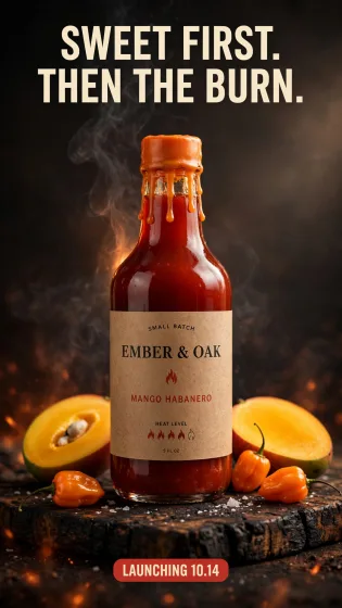
Prompt
SCENE: A vertical product teaser for the launch of a small batch hot sauce, shot like a premium food ad. The label design and every printed word on it are the hero. FRAME: Vertical 9:16 phone frame. Keep the face, product and headline inside the middle two thirds. Leave the top eighth and the bottom fifth free of critical detail, because app interface and captions sit there. Favor vertical depth: foreground, subject, background stacked top to bottom. PRODUCT: A 5 ounce woozy glass bottle filled with glossy deep red habanero sauce, a bright orange wax dipped cap with drips down the neck. The label is wraparound kraft paper printed in two colors, black and tomato red. Printed on the label, centered and wrapping with the curve of the glass: at the top in small caps "SMALL BATCH"; the brand "EMBER & OAK" in a bold slab serif; a simple red flame icon; beneath it "MANGO HABANERO" in a condensed sans; and at the bottom "HEAT LEVEL" followed by five small flame outlines, four of them filled red. Tiny line at the base: "5 FL OZ". SET: The bottle stands on a charred oak cutting board. Around it: two halved ripe mangoes with bright yellow flesh, three orange habanero peppers, a few flakes of sea salt, and a thin trail of smoke drifting up from behind the bottle. Background is a warm charcoal gradient with glowing embers softly out of focus at the bottom. OVERLAY TEXT: Top of frame, in a bold condensed sans serif, cream colored: "SWEET FIRST." on one line, then "THEN THE BURN." on the next. Lower third, a small tomato red rounded tag with cream text: "LAUNCHING 10.14". That plus the label is all the text. LIGHT AND LENS: Moody studio light. A soft box from the upper right makes a long highlight down the bottle and makes the sauce glow translucent red. A warm orange kicker from behind picks out the smoke and the wax drips. 100mm macro lens at f/8, camera level with the label so it reads straight on. STYLE: Rich, fiery, appetizing commercial photography with realistic glass refraction and wax texture. EXECUTION: Follow every instruction above literally and in order of importance: first the exact wording, spelling and placement of every quoted string, then the layout hierarchy, then the photographic or illustrative detail. Each quoted string appears exactly once, with the stated case and punctuation, crisp even kerning, straight baselines and consistent font weights within each group. Keep type inside its intended zone with comfortable margins so nothing touches the frame edge. People look like real individuals with natural skin texture, relaxed expressions and hands with five well formed fingers. The only text in the image is the text quoted in this prompt, and the image carries no logos or watermarks beyond what is described. Treat the typography like a finished design file: headline largest, supporting line second, small labels last, with consistent alignment and spacing between lines.
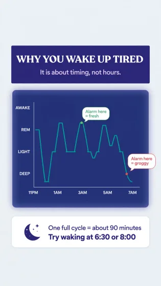
Prompt
SCENE: A vertical educational infographic frame for a health explainer Short about why you wake up groggy. Clean, flat editorial illustration style, like a modern science magazine page. Accuracy and clear hierarchy matter more than decoration. FRAME: Vertical 9:16 phone frame. Keep the face, product and headline inside the middle two thirds. Leave the top eighth and the bottom fifth free of critical detail, because app interface and captions sit there. Favor vertical depth: foreground, subject, background stacked top to bottom. LAYOUT (top to bottom): 1. Header band: deep indigo background. Title in bold white rounded sans serif: "WHY YOU WAKE UP TIRED". Subtitle in pale lavender: "It is about timing, not hours." 2. Main chart: a simple hypnogram line chart across the middle of the frame on a slightly lighter navy panel. The x axis is labeled at even intervals "11PM", "1AM", "3AM", "5AM", "7AM". The y axis has four labeled levels from top to bottom: "AWAKE", "REM", "LIGHT", "DEEP". A smooth teal line steps down and up through about five cycles, with deep sleep dips longer early in the night and REM peaks longer toward morning. At one point near "7AM" the line is in "DEEP", marked with a red dot and a callout bubble reading "Alarm here = groggy". A second green dot at a nearby REM peak has a callout "Alarm here = fresh". 3. Bottom card: a rounded white card with a crescent moon icon on the left and two lines of navy text: "One full cycle = about 90 minutes" and in bold "Try waking at 6:30 or 8:00". STYLE AND COLOR: Flat vector illustration, no photography, no gradients except a subtle glow behind the chart. Palette: indigo, navy, teal, lavender, one red accent and one green accent. Consistent line weights, perfectly aligned axes and labels, generous margins, all labels spelled exactly as given and placed next to the correct element. EXECUTION: Follow every instruction above literally and in order of importance: first the exact wording, spelling and placement of every quoted string, then the layout hierarchy, then the photographic or illustrative detail. Each quoted string appears exactly once, with the stated case and punctuation, crisp even kerning, straight baselines and consistent font weights within each group. Keep type inside its intended zone with comfortable margins so nothing touches the frame edge. People look like real individuals with natural skin texture, relaxed expressions and hands with five well formed fingers. The only text in the image is the text quoted in this prompt, and the image carries no logos or watermarks beyond what is described. Treat the typography like a finished design file: headline largest, supporting line second, small labels last, with consistent alignment and spacing between lines.
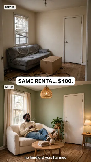
Prompt
SCENE: A UGC style before and after ad still for a home decor app, shot as a real customer post. Vertical split: the top half is the before photo, the bottom half is the after photo of the same small rental living room in Atlanta from the same camera angle. This is the kind of multi image composition where the room layout, window and door must match exactly between halves. FRAME: Vertical 9:16 phone frame. Keep the face, product and headline inside the middle two thirds. Leave the top eighth and the bottom fifth free of critical detail, because app interface and captions sit there. Favor vertical depth: foreground, subject, background stacked top to bottom. TOP HALF (BEFORE): A cramped living room with beige walls, a sagging grey futon, a cardboard box used as a coffee table, a bare bulb ceiling light, a single window with bent white blinds, and cables on the floor. Flat dull light. Small white rounded label in the top left corner of the half with black text: "BEFORE". BOTTOM HALF (AFTER): The same room, same window, same door on the right and same wood floor, now painted a warm sage green. A cream boucle loveseat, a round oak coffee table with a stack of books and a small vase of dried pampas, a jute rug, linen curtains replacing the blinds, a rattan pendant light, a large trailing pothos on a plant stand, and warm table lamp light. Label in its top left corner: "AFTER". CREATOR ELEMENT: In the after half, the creator sits on the loveseat: a 29 year old Black man with short locs, a cream knit sweater and relaxed jeans, laughing and holding a mug, feet up on the coffee table edge. OVERLAY TEXT: Centered on the seam between the halves, a white rounded rectangle with bold black text: "SAME RENTAL. $400." And near the bottom of the frame above the safe area, small white text with a soft shadow: "no landlord was harmed". Only these two overlay lines plus the two labels. LENS AND STYLE: Both halves shot on a phone at 24mm from the doorway at chest height. Real textures on fabric and wood, true to life color, bright natural afternoon light in the after half. Authentic, not staged like a catalog. EXECUTION: Follow every instruction above literally and in order of importance: first the exact wording, spelling and placement of every quoted string, then the layout hierarchy, then the photographic or illustrative detail. Each quoted string appears exactly once, with the stated case and punctuation, crisp even kerning, straight baselines and consistent font weights within each group. Keep type inside its intended zone with comfortable margins so nothing touches the frame edge. People look like real individuals with natural skin texture, relaxed expressions and hands with five well formed fingers. The only text in the image is the text quoted in this prompt, and the image carries no logos or watermarks beyond what is described. Treat the typography like a finished design file: headline largest, supporting line second, small labels last, with consistent alignment and spacing between lines.
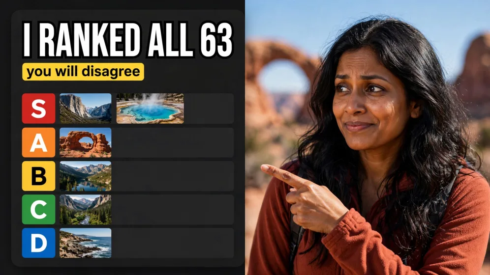
Prompt
SCENE: A YouTube thumbnail for a travel video that ranks US national parks. Composite layout: a presenter on the right, a tier list board on the left, and a bold number headline. Legibility at small size is the priority. FRAME: Horizontal 16:9 widescreen frame, readable at thumbnail size on a phone. Use the left and right thirds deliberately, one side for the subject and one side for the headline, with strong separation between them. PRESENTER: A 33 year old Indian American woman with long wavy black hair, a rust colored hiking fleece, a small backpack strap visible on her shoulder. Framed from the chest up in the right third, turned slightly toward the board, pointing at it with her left hand, playful skeptical expression with one eyebrow up and a closed mouth smile. Behind her, softly blurred, the red rock arches of Utah under a clear blue sky. TIER BOARD: On the left half, a clean tier list graphic on a dark charcoal panel with rounded corners. Five rows, each with a colored letter tile on the left: "S" in red, "A" in orange, "B" in yellow, "C" in green, "D" in blue. The S row holds two small square landscape photos, one of a granite cliff valley and one of a turquoise hot spring. The A row holds one photo of red sandstone arches. The rows B, C and D each hold one small photo. No park names are written, only the letters. HEADLINE: Across the top left, above the board, huge bold white condensed sans serif with a thick black outline: "I RANKED ALL 63". Beneath the headline, a small yellow highlight bar with black text: "you will disagree". Nothing else is written. LIGHT AND STYLE: Bright, sunny, high contrast, saturated but natural color on the presenter, crisp rim light separating her from the background. The board graphic is flat and sharp. 50mm lens look on the presenter, f/2.8, background soft. Classic high performing YouTube thumbnail energy. EXECUTION: Follow every instruction above literally and in order of importance: first the exact wording, spelling and placement of every quoted string, then the layout hierarchy, then the photographic or illustrative detail. Each quoted string appears exactly once, with the stated case and punctuation, crisp even kerning, straight baselines and consistent font weights within each group. Keep type inside its intended zone with comfortable margins so nothing touches the frame edge. People look like real individuals with natural skin texture, relaxed expressions and hands with five well formed fingers. The only text in the image is the text quoted in this prompt, and the image carries no logos or watermarks beyond what is described. Treat the typography like a finished design file: headline largest, supporting line second, small labels last, with consistent alignment and spacing between lines.
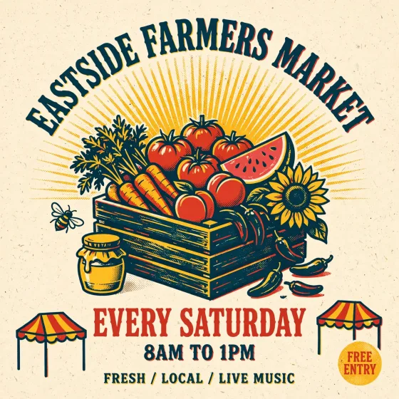
Prompt
SCENE: A square Instagram feed post promoting a Saturday farmers market in Austin, Texas, designed as a bold screen printed poster. Illustration, not photography. The typography and layout are the hero and must be exactly as specified. FRAME: Square 1:1 feed frame. Center of gravity sits in the middle, with balanced breathing room on all four sides and nothing important in the corners, which get cropped in grid previews. ILLUSTRATION: A flat, three color risograph style illustration in tomato red, sunflower yellow and deep teal on a cream paper background with visible riso grain and slight misregistration. In the center, a big overflowing wooden crate of produce: heirloom tomatoes, a bunch of carrots with leafy tops, a watermelon wedge, peaches, a sunflower and a few jalapenos. Behind it, a simple sunburst of radiating lines. Small illustrated details: a honey jar, a bee, a striped market tent at the bottom corners. TYPOGRAPHY (exact): Top, arched along the sunburst in a chunky retro serif, teal: "EASTSIDE FARMERS MARKET". Below the crate, in a heavy condensed sans serif, red: "EVERY SATURDAY". Beneath that in the same font, smaller, teal: "8AM TO 1PM". At the very bottom in small uppercase with wide tracking: "FRESH / LOCAL / LIVE MUSIC". Bottom right, a small yellow circle badge with red text "FREE ENTRY". STYLE: Hand crafted print poster feel, balanced symmetrical composition, generous margins, bold readable type at small size, joyful summer mood. Keep the three ink colors consistent across illustration and type. EXECUTION: Follow every instruction above literally and in order of importance: first the exact wording, spelling and placement of every quoted string, then the layout hierarchy, then the photographic or illustrative detail. Each quoted string appears exactly once, with the stated case and punctuation, crisp even kerning, straight baselines and consistent font weights within each group. Keep type inside its intended zone with comfortable margins so nothing touches the frame edge. People look like real individuals with natural skin texture, relaxed expressions and hands with five well formed fingers. The only text in the image is the text quoted in this prompt, and the image carries no logos or watermarks beyond what is described. Treat the typography like a finished design file: headline largest, supporting line second, small labels last, with consistent alignment and spacing between lines.
Prompt
SCENE: The first frame of a TikTok budgeting video. A young mom in a grocery store parking lot in suburban Ohio holds up a long paper receipt to the camera with a playful shocked face. The receipt is the proof, so its printed text must be sharp and exact. FRAME: Vertical 9:16 phone frame. Keep the face, product and headline inside the middle two thirds. Leave the top eighth and the bottom fifth free of critical detail, because app interface and captions sit there. Favor vertical depth: foreground, subject, background stacked top to bottom. SUBJECT: A 30 year old Korean American woman with a sleek low ponytail, small gold hoops, a cropped denim jacket over a black ribbed tank. She stands beside the open trunk of a silver minivan full of reusable grocery bags. Her right hand holds the receipt up beside her face, the paper unspooling down past her waist and curling at the end. Her left hand is on her cheek. Mouth in a round surprised "o", eyes wide, looking straight into the lens. RECEIPT TEXT: Thermal paper receipt with a faint grey tint, printed in a monospace receipt font, black ink, left aligned with prices right aligned. Top center: "FRESH VALLEY MARKET". Then item lines: "EGGS 18CT 4.29", "WHOLE MILK GAL 3.49", "BANANAS 2.1LB 1.26", "CHICKEN THIGHS 8.92", "RICE 10LB 9.99", "SPINACH 2.50". Then a dashed separator made of short printed dashes on the paper itself. Then in bold: "TOTAL 62.18". Below that: "YOU SAVED 41.07". Text is flat enough on the paper to read clearly despite the gentle curl. OVERLAY TEXT: At the top of the frame in a heavy white sans serif with a black outline, two lines centered: "FEEDING 4 FOR $62" and below in bright green "HERE IS HOW". No other overlay. SETTING AND LIGHT: Overcast early afternoon, soft even daylight with a gentle key from the left. Background: a slightly blurred parking lot, rows of cars, cart corral, the green awning of the store. Phone camera look, 26mm wide lens at arm length, slight low angle, subject and receipt sharp, background softly out of focus. STYLE: Authentic creator content, natural color, slightly lifted shadows, relatable and fun. EXECUTION: Follow every instruction above literally and in order of importance: first the exact wording, spelling and placement of every quoted string, then the layout hierarchy, then the photographic or illustrative detail. Each quoted string appears exactly once, with the stated case and punctuation, crisp even kerning, straight baselines and consistent font weights within each group. Keep type inside its intended zone with comfortable margins so nothing touches the frame edge. People look like real individuals with natural skin texture, relaxed expressions and hands with five well formed fingers. The only text in the image is the text quoted in this prompt, and the image carries no logos or watermarks beyond what is described. Treat the typography like a finished design file: headline largest, supporting line second, small labels last, with consistent alignment and spacing between lines.
Prompt
SCENE: A faceless bilingual quote frame for an Instagram Reel aimed at Hindi speaking viewers in the United States. A single brass diya oil lamp burns on a dark wooden surface at night, and a short quote in Hindi Devanagari with an English line below it is set as clean graphic type above it. FRAME: Vertical 9:16 phone frame. Keep the face, product and headline inside the middle two thirds. Leave the top eighth and the bottom fifth free of critical detail, because app interface and captions sit there. Favor vertical depth: foreground, subject, background stacked top to bottom. COMPOSITION: The diya sits in the lower third, centered, its small flame bright and steady with a warm halo. Around it: a few scattered marigold petals in saffron and yellow, a folded length of deep maroon silk with a thin gold border, and three tiny tealight holders out of focus in the background creating round bokeh. The upper two thirds is deep, velvety darkness with a subtle warm vignette, giving the type a clean field. TEXT (exact, in this order, centered): Line 1, in an elegant Devanagari display face in warm gold: "जो है, उसी में खुश रहो". Line 2, a thin gold ornamental rule, short and centered. Line 3, in a refined English serif, off white, italic: "Be happy with what you have." Line 4, small tracked uppercase sans serif in gold at 70 percent opacity: "DAILY SHUKRIYA". The Devanagari must be rendered correctly, with every matra, the shirorekha headline joining each word, the comma and spacing exactly as given. The English sits smaller than the Hindi so the Hindi is the hero. LIGHT AND LENS: The diya flame is the only key light, casting warm amber light across the petals and silk, with realistic falloff into darkness and tiny specular highlights on the brass. Shot on an 85mm lens at f/2, camera slightly above table height, flame and lamp rim tack sharp. STYLE: Calm, devotional, premium. Palette of black, amber, saffron, maroon and gold. Fine grain, no heavy effects. EXECUTION: Follow every instruction above literally and in order of importance: first the exact wording, spelling and placement of every quoted string, then the layout hierarchy, then the photographic or illustrative detail. Each quoted string appears exactly once, with the stated case and punctuation, crisp even kerning, straight baselines and consistent font weights within each group. Keep type inside its intended zone with comfortable margins so nothing touches the frame edge. People look like real individuals with natural skin texture, relaxed expressions and hands with five well formed fingers. The only text in the image is the text quoted in this prompt, and the image carries no logos or watermarks beyond what is described. Treat the typography like a finished design file: headline largest, supporting line second, small labels last, with consistent alignment and spacing between lines.
Prompt
SCENE: A YouTube thumbnail for a travel video that ranks US national parks. Composite layout: a presenter on the right, a tier list board on the left, and a bold number headline. Legibility at small size is the priority. FRAME: Horizontal 16:9 widescreen frame, readable at thumbnail size on a phone. Use the left and right thirds deliberately, one side for the subject and one side for the headline, with strong separation between them. PRESENTER: A 33 year old Indian American woman with long wavy black hair, a rust colored hiking fleece, a small backpack strap visible on her shoulder. Framed from the chest up in the right third, turned slightly toward the board, pointing at it with her left hand, playful skeptical expression with one eyebrow up and a closed mouth smile. Behind her, softly blurred, the red rock arches of Utah under a clear blue sky. TIER BOARD: On the left half, a clean tier list graphic on a dark charcoal panel with rounded corners. Five rows, each with a colored letter tile on the left: "S" in red, "A" in orange, "B" in yellow, "C" in green, "D" in blue. The S row holds two small square landscape photos, one of a granite cliff valley and one of a turquoise hot spring. The A row holds one photo of red sandstone arches. The rows B, C and D each hold one small photo. No park names are written, only the letters. HEADLINE: Across the top left, above the board, huge bold white condensed sans serif with a thick black outline: "I RANKED ALL 63". Beneath the headline, a small yellow highlight bar with black text: "you will disagree". Nothing else is written. LIGHT AND STYLE: Bright, sunny, high contrast, saturated but natural color on the presenter, crisp rim light separating her from the background. The board graphic is flat and sharp. 50mm lens look on the presenter, f/2.8, background soft. Classic high performing YouTube thumbnail energy. EXECUTION: Follow every instruction above literally and in order of importance: first the exact wording, spelling and placement of every quoted string, then the layout hierarchy, then the photographic or illustrative detail. Each quoted string appears exactly once, with the stated case and punctuation, crisp even kerning, straight baselines and consistent font weights within each group. Keep type inside its intended zone with comfortable margins so nothing touches the frame edge. People look like real individuals with natural skin texture, relaxed expressions and hands with five well formed fingers. The only text in the image is the text quoted in this prompt, and the image carries no logos or watermarks beyond what is described. Treat the typography like a finished design file: headline largest, supporting line second, small labels last, with consistent alignment and spacing between lines.
Prompt
SCENE: A vertical product teaser for the launch of a small batch hot sauce, shot like a premium food ad. The label design and every printed word on it are the hero. FRAME: Vertical 9:16 phone frame. Keep the face, product and headline inside the middle two thirds. Leave the top eighth and the bottom fifth free of critical detail, because app interface and captions sit there. Favor vertical depth: foreground, subject, background stacked top to bottom. PRODUCT: A 5 ounce woozy glass bottle filled with glossy deep red habanero sauce, a bright orange wax dipped cap with drips down the neck. The label is wraparound kraft paper printed in two colors, black and tomato red. Printed on the label, centered and wrapping with the curve of the glass: at the top in small caps "SMALL BATCH"; the brand "EMBER & OAK" in a bold slab serif; a simple red flame icon; beneath it "MANGO HABANERO" in a condensed sans; and at the bottom "HEAT LEVEL" followed by five small flame outlines, four of them filled red. Tiny line at the base: "5 FL OZ". SET: The bottle stands on a charred oak cutting board. Around it: two halved ripe mangoes with bright yellow flesh, three orange habanero peppers, a few flakes of sea salt, and a thin trail of smoke drifting up from behind the bottle. Background is a warm charcoal gradient with glowing embers softly out of focus at the bottom. OVERLAY TEXT: Top of frame, in a bold condensed sans serif, cream colored: "SWEET FIRST." on one line, then "THEN THE BURN." on the next. Lower third, a small tomato red rounded tag with cream text: "LAUNCHING 10.14". That plus the label is all the text. LIGHT AND LENS: Moody studio light. A soft box from the upper right makes a long highlight down the bottle and makes the sauce glow translucent red. A warm orange kicker from behind picks out the smoke and the wax drips. 100mm macro lens at f/8, camera level with the label so it reads straight on. STYLE: Rich, fiery, appetizing commercial photography with realistic glass refraction and wax texture. EXECUTION: Follow every instruction above literally and in order of importance: first the exact wording, spelling and placement of every quoted string, then the layout hierarchy, then the photographic or illustrative detail. Each quoted string appears exactly once, with the stated case and punctuation, crisp even kerning, straight baselines and consistent font weights within each group. Keep type inside its intended zone with comfortable margins so nothing touches the frame edge. People look like real individuals with natural skin texture, relaxed expressions and hands with five well formed fingers. The only text in the image is the text quoted in this prompt, and the image carries no logos or watermarks beyond what is described. Treat the typography like a finished design file: headline largest, supporting line second, small labels last, with consistent alignment and spacing between lines.
Prompt
SCENE: A square Instagram feed post promoting a Saturday farmers market in Austin, Texas, designed as a bold screen printed poster. Illustration, not photography. The typography and layout are the hero and must be exactly as specified. FRAME: Square 1:1 feed frame. Center of gravity sits in the middle, with balanced breathing room on all four sides and nothing important in the corners, which get cropped in grid previews. ILLUSTRATION: A flat, three color risograph style illustration in tomato red, sunflower yellow and deep teal on a cream paper background with visible riso grain and slight misregistration. In the center, a big overflowing wooden crate of produce: heirloom tomatoes, a bunch of carrots with leafy tops, a watermelon wedge, peaches, a sunflower and a few jalapenos. Behind it, a simple sunburst of radiating lines. Small illustrated details: a honey jar, a bee, a striped market tent at the bottom corners. TYPOGRAPHY (exact): Top, arched along the sunburst in a chunky retro serif, teal: "EASTSIDE FARMERS MARKET". Below the crate, in a heavy condensed sans serif, red: "EVERY SATURDAY". Beneath that in the same font, smaller, teal: "8AM TO 1PM". At the very bottom in small uppercase with wide tracking: "FRESH / LOCAL / LIVE MUSIC". Bottom right, a small yellow circle badge with red text "FREE ENTRY". STYLE: Hand crafted print poster feel, balanced symmetrical composition, generous margins, bold readable type at small size, joyful summer mood. Keep the three ink colors consistent across illustration and type. EXECUTION: Follow every instruction above literally and in order of importance: first the exact wording, spelling and placement of every quoted string, then the layout hierarchy, then the photographic or illustrative detail. Each quoted string appears exactly once, with the stated case and punctuation, crisp even kerning, straight baselines and consistent font weights within each group. Keep type inside its intended zone with comfortable margins so nothing touches the frame edge. People look like real individuals with natural skin texture, relaxed expressions and hands with five well formed fingers. The only text in the image is the text quoted in this prompt, and the image carries no logos or watermarks beyond what is described. Treat the typography like a finished design file: headline largest, supporting line second, small labels last, with consistent alignment and spacing between lines.
Prompt
SCENE: A vertical educational infographic frame for a health explainer Short about why you wake up groggy. Clean, flat editorial illustration style, like a modern science magazine page. Accuracy and clear hierarchy matter more than decoration. FRAME: Vertical 9:16 phone frame. Keep the face, product and headline inside the middle two thirds. Leave the top eighth and the bottom fifth free of critical detail, because app interface and captions sit there. Favor vertical depth: foreground, subject, background stacked top to bottom. LAYOUT (top to bottom): 1. Header band: deep indigo background. Title in bold white rounded sans serif: "WHY YOU WAKE UP TIRED". Subtitle in pale lavender: "It is about timing, not hours." 2. Main chart: a simple hypnogram line chart across the middle of the frame on a slightly lighter navy panel. The x axis is labeled at even intervals "11PM", "1AM", "3AM", "5AM", "7AM". The y axis has four labeled levels from top to bottom: "AWAKE", "REM", "LIGHT", "DEEP". A smooth teal line steps down and up through about five cycles, with deep sleep dips longer early in the night and REM peaks longer toward morning. At one point near "7AM" the line is in "DEEP", marked with a red dot and a callout bubble reading "Alarm here = groggy". A second green dot at a nearby REM peak has a callout "Alarm here = fresh". 3. Bottom card: a rounded white card with a crescent moon icon on the left and two lines of navy text: "One full cycle = about 90 minutes" and in bold "Try waking at 6:30 or 8:00". STYLE AND COLOR: Flat vector illustration, no photography, no gradients except a subtle glow behind the chart. Palette: indigo, navy, teal, lavender, one red accent and one green accent. Consistent line weights, perfectly aligned axes and labels, generous margins, all labels spelled exactly as given and placed next to the correct element. EXECUTION: Follow every instruction above literally and in order of importance: first the exact wording, spelling and placement of every quoted string, then the layout hierarchy, then the photographic or illustrative detail. Each quoted string appears exactly once, with the stated case and punctuation, crisp even kerning, straight baselines and consistent font weights within each group. Keep type inside its intended zone with comfortable margins so nothing touches the frame edge. People look like real individuals with natural skin texture, relaxed expressions and hands with five well formed fingers. The only text in the image is the text quoted in this prompt, and the image carries no logos or watermarks beyond what is described. Treat the typography like a finished design file: headline largest, supporting line second, small labels last, with consistent alignment and spacing between lines.
Prompt
SCENE: A UGC style before and after ad still for a home decor app, shot as a real customer post. Vertical split: the top half is the before photo, the bottom half is the after photo of the same small rental living room in Atlanta from the same camera angle. This is the kind of multi image composition where the room layout, window and door must match exactly between halves. FRAME: Vertical 9:16 phone frame. Keep the face, product and headline inside the middle two thirds. Leave the top eighth and the bottom fifth free of critical detail, because app interface and captions sit there. Favor vertical depth: foreground, subject, background stacked top to bottom. TOP HALF (BEFORE): A cramped living room with beige walls, a sagging grey futon, a cardboard box used as a coffee table, a bare bulb ceiling light, a single window with bent white blinds, and cables on the floor. Flat dull light. Small white rounded label in the top left corner of the half with black text: "BEFORE". BOTTOM HALF (AFTER): The same room, same window, same door on the right and same wood floor, now painted a warm sage green. A cream boucle loveseat, a round oak coffee table with a stack of books and a small vase of dried pampas, a jute rug, linen curtains replacing the blinds, a rattan pendant light, a large trailing pothos on a plant stand, and warm table lamp light. Label in its top left corner: "AFTER". CREATOR ELEMENT: In the after half, the creator sits on the loveseat: a 29 year old Black man with short locs, a cream knit sweater and relaxed jeans, laughing and holding a mug, feet up on the coffee table edge. OVERLAY TEXT: Centered on the seam between the halves, a white rounded rectangle with bold black text: "SAME RENTAL. $400." And near the bottom of the frame above the safe area, small white text with a soft shadow: "no landlord was harmed". Only these two overlay lines plus the two labels. LENS AND STYLE: Both halves shot on a phone at 24mm from the doorway at chest height. Real textures on fabric and wood, true to life color, bright natural afternoon light in the after half. Authentic, not staged like a catalog. EXECUTION: Follow every instruction above literally and in order of importance: first the exact wording, spelling and placement of every quoted string, then the layout hierarchy, then the photographic or illustrative detail. Each quoted string appears exactly once, with the stated case and punctuation, crisp even kerning, straight baselines and consistent font weights within each group. Keep type inside its intended zone with comfortable margins so nothing touches the frame edge. People look like real individuals with natural skin texture, relaxed expressions and hands with five well formed fingers. The only text in the image is the text quoted in this prompt, and the image carries no logos or watermarks beyond what is described. Treat the typography like a finished design file: headline largest, supporting line second, small labels last, with consistent alignment and spacing between lines.
What Meta Muse delivers
Faithful instruction following
Meta describes Muse Image as its most advanced image model, built to follow instructions faithfully. Multi-part prompts with layout, color and copy requirements come back as written.
Clean text for guides and infographics
Meta says Muse renders text cleanly inside visuals, enough for how-to guides and detailed infographics. Quote the exact words and they appear as lettering in the scene.
Multilingual lettering
Muse renders non-Latin scripts. Fliki has verified Devanagari, so thumbnails can carry a Hindi title baked into the image instead of an overlay.
Up to 10 reference images
Compose from people, objects, clothing, styles and environments across up to 10 references on Fliki. Meta's own example blends a selfie and a vacation photo into a custom postcard.
Precise edits
Muse changes exactly what you ask for and keeps the rest. Swap a product, restyle a room or restore an old photo without rebuilding the image.
Reasons before it renders
Meta says Muse reflects on and improves its own work within its chain of thought, choosing between a local fix, a full regeneration or a different approach.
Fast and credit-light
A Fliki render takes about 20 seconds and costs fewer credits than GPT Image 2.5 or Nano Banana 2, which makes it a practical pick for large batches of text-heavy frames.
Ranked near the top of Arena
At launch Meta reported Muse Image at number 2 on the Arena leaderboards for text-to-image, single-image editing and multi-image editing (as of July 5, 2026).
How it works
How to generate an image with Meta Muse
Meta Muse runs inside Fliki's AI image generator. Here's the six-step flow.
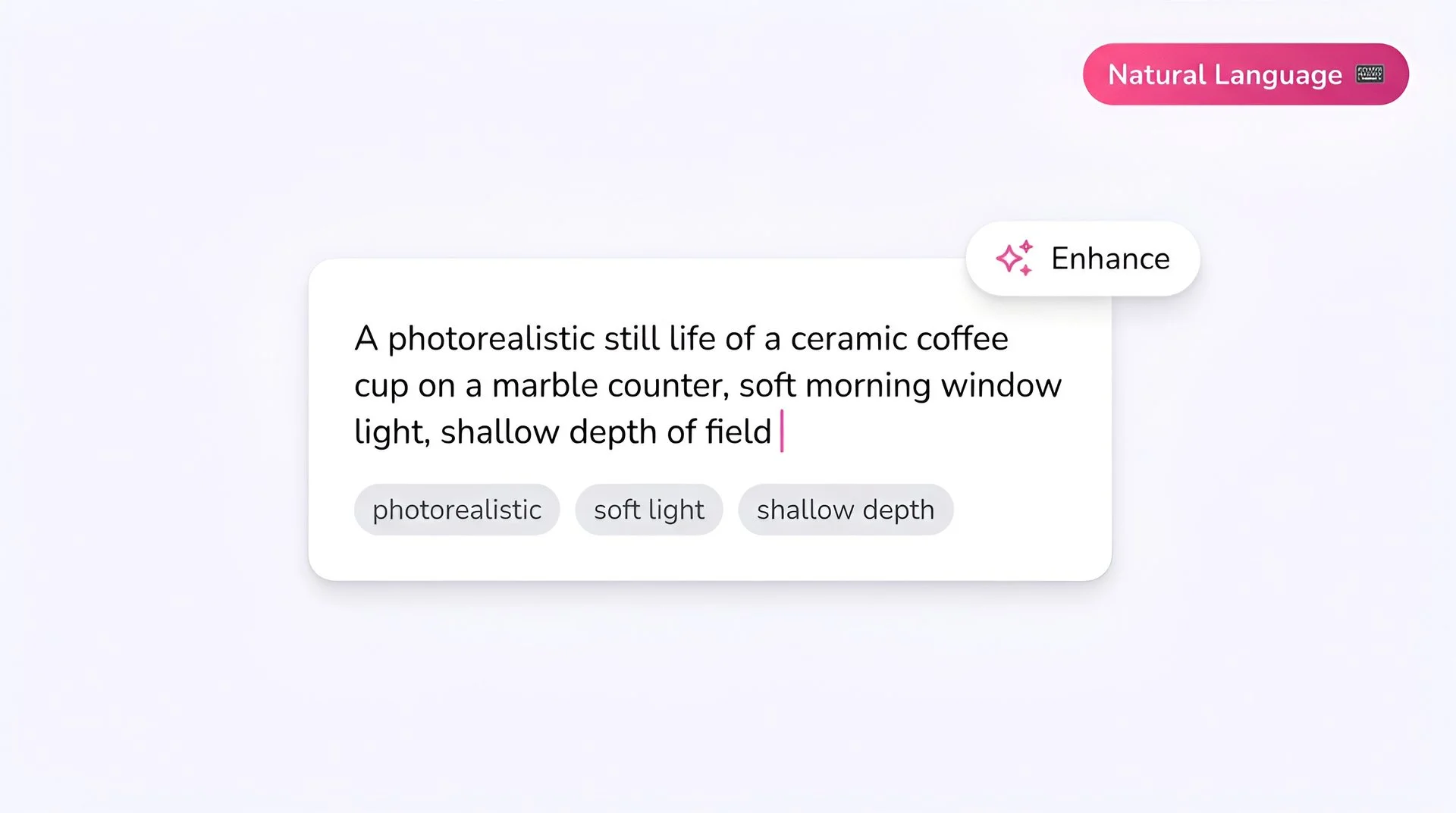
Write your prompt
Describe what you want in plain, specific language. Muse follows instructions closely, so list layout, colors and any on-image words in quotes. Phrase everything positively: Muse does not accept negative prompts.
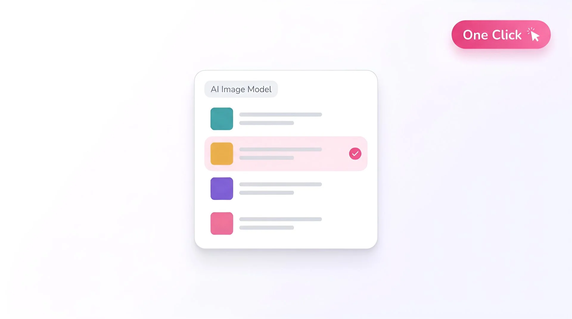
Select Meta Muse as your model
Open Fliki's model selector and choose Meta Muse. Your prompt routes to Meta's Muse Image model.
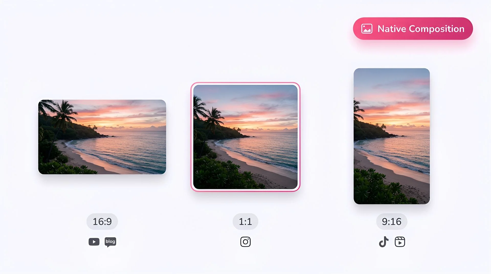
Pick your aspect ratio
Choose 9:16 for vertical video, 16:9 for YouTube and slides, or 1:1 for feed posts.
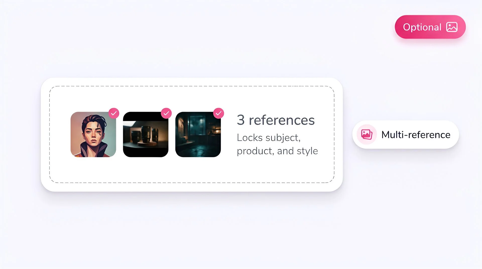
Add reference images (optional)
Upload up to 10 references to blend people, products, outfits, styles or places into one image. References are optional: the same model handles plain text-to-image.
Check your text
Spell every headline, label and number exactly as it should appear. Muse also letters non-Latin scripts, which Fliki has verified with Devanagari.
Generate
Hit Generate. A render typically takes around 20 seconds. Meta Muse is available on Fliki paid plans alongside GPT Image 2.5, Nano Banana 2 and the rest of the premium catalog.
AI MODEL GALLERY
Built on the best AI models - ready inside Fliki
Every leading video, voice, and image model - integrated, unified, and tuned for creators. Generate with the latest AI video, AI voice, and AI image models from OpenAI, Google, Kling, Bytedance, ElevenLabs, and more - all from one place.
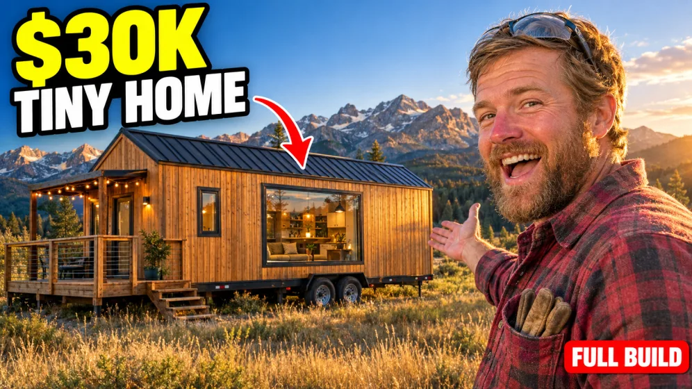
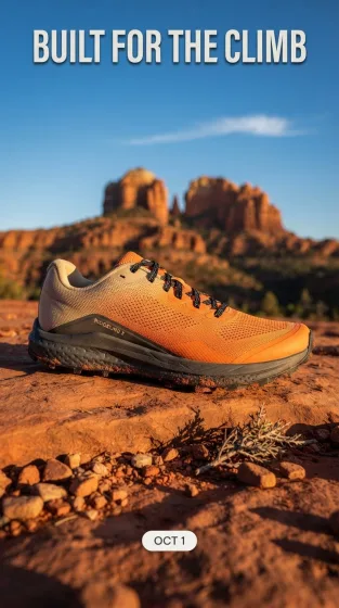
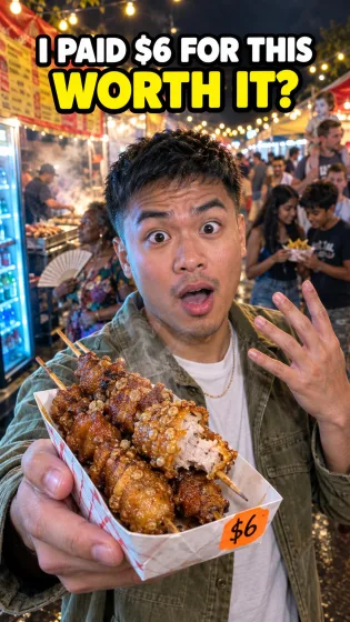
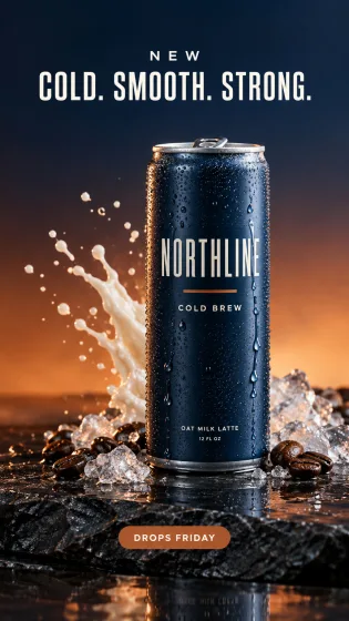
Meta Muse FAQ
Frequently asked questions
Everything you need to know about generating images with Meta Muse inside Fliki.
Muse Image is Meta's image generation model, the first from Meta Superintelligence Labs. It launched on July 7, 2026 in the Meta AI app and on meta.ai, and it generates, edits and composes images from multiple references.
No. Meta Muse requires a paid Fliki subscription. It is not available on the Free plan or on lifetime deal plans.
Yes. Meta positions clean in-image text as a core strength, including for how-to guides and infographics. Put the exact words in quotes and keep each line short.
Yes. Muse renders non-Latin scripts. Fliki has verified Devanagari (Hindi) lettering and uses Muse to bake non-English titles into thumbnails.
Up to 10 on Fliki. References are optional. The same model handles text-to-image and reference-based editing.
No. Muse rejects negative prompts, so Fliki does not send one. Describe what you want to see instead of what to avoid.
Meta runs its own content moderation on every request. Prompts involving real people's likeness in distress, among other categories, can be refused upstream, and no Fliki setting overrides that.
Meta Muse is the lowest-credit of the three and a strong pick for text-heavy layouts and multilingual lettering. GPT Image 2.5 leads on photoreal detail and long prompts with up to 16 references. Nano Banana 2 Lite is the fastest, built for quick edits and drafts on Standard and Premium plans.
Still curious?
Try Fliki free in your browser, no credit card required.
Start free→AI image models
Discover more
Tools
Discover features
Generate your next image with Meta Muse.
Upgrade your Fliki plan to unlock Meta Muse and the rest of the premium catalog.
Upgrade to generateFree forever plan · No credit card required · Cancel anytime