Your software is invisible. The explainer's job is to make it real.
Here is the specific problem with selling SaaS: there is nothing to hold up to the camera. Your value lives inside an abstract workflow, data moving, tasks routing, a dashboard updating, that a visitor cannot see or touch. That is exactly why a SaaS explainer video is one of the highest-leverage assets you can make, and also why so many of them fail. Most SaaS explainers try to solve the "invisible product" problem by listing every feature, and a feature list is the fastest way to make a viewer feel nothing.
A great SaaS explainer does the opposite. It makes one invisible workflow feel concrete, shows your actual product solving a real job, and gets the viewer to click "start free trial." This guide walks through exactly how to build one: the SaaS-specific script that leads with the job, not the login screen, the right length for wherever the video lives, the animation style that fits software, and a step-by-step workflow to generate a branded motion-graphics explainer, from your own website and UI, in minutes.
Let us start with what makes a SaaS explainer different from any other explainer.

What makes a SaaS explainer video different
Every explainer follows the same backbone, but SaaS has four demands of its own.
Show the product solving a job, not touring menus. The biggest mistake in SaaS video is opening on the interface. As the team at iStudiosMedia puts it, for a CRM you should not open on the login screen, you open on the moment a lead is captured and instantly routed to the right rep. Show the value of the action before you explain the mechanics of the feature. Animated, real UI in context is what makes an abstract backend feel tangible.
Lead with the job to be done, not the software. Frame the whole video around the progress your customer is trying to make and the pain that blocks it, then reveal the product as the resolution. "Marketing teams waste hours in status meetings because task updates live in scattered threads" is a SaaS hook. "Our project management platform has many features" is not.
Sell the outcome, and run every claim through the "so what" test. For each line, ask "so what does that get me?" If a feature does not survive to a concrete benefit, cut it. One core value proposition beats ten features.
Use the style built for abstract workflows. Motion graphics with animated UI is the default SaaS style for a reason: it makes data flows, integrations, and permissions legible without a physical set or a film crew. More on choosing a style below.
Does a SaaS explainer actually move the needle?
It does, because software buyers genuinely use video to decide. In Wyzowl's 2026 survey, 96 percent of people said they have watched an explainer to learn about a product, 63 percent said a short video is their single most-preferred way to learn about one, 93 percent of marketers said video improved understanding of their product, and 82 percent reported good ROI from video. For an intangible product, that "improved understanding" number is the whole game.
Placement matters as much as the video. In a well-known Unbounce and Vidyard case study, the same video on the same page lifted conversion by 100 percent as a lightbox pop-up and by 69 percent embedded inline. Treat that as one strong example rather than a universal law, because real lift varies widely by product and audience, but the direction is clear: a clear explainer, placed well, moves signups.
Two numbers to ignore while you research, because they are folklore: the claim that "video on a landing page boosts conversions 80 to 86 percent" traces to a single defunct-vendor brochure and is not reliable, and the famous "Dropbox explainer made 48 million dollars" figure is an after-the-fact estimate, not documented revenue. The real, sourced Dropbox result is better and more useful, and we will get to it.
The SaaS explainer script (lead with the job, not the login screen)
The script is 90 percent of whether your explainer works, so build it deliberately. The SaaS-tuned version of the classic structure looks like this:
Hook on the moment of value or the pain (0 to 5 seconds). Open on the job your user is trying to do, or the specific frustration blocking it. Not "meet [Product]."
Name the problem, specifically. Vague problems get vague attention. Name the exact, recognizable pain, and let it dictate your visuals.
Reveal the product solving it in two or three steps. Show the real UI doing the job end to end, quickly. This is where animated screens earn their keep.
State one core value proposition, as an outcome. The single most important thing the viewer walks away with.
Add one piece of proof. A number, a logo, a result.
One clear call to action. Start free trial, or book a demo. Never three competing links.
If you want a fill-in-the-blank framework and proven formulas for each beat, our explainer video script template gives you copy-paste structures. The SaaS-specific discipline to add on top is the jobs-to-be-done lens: write for the progress the customer is hiring your software to make, in a specific situation, and the script writes itself.
Pick the right length for where the video lives
There is no single "correct" length. The right length depends on how warm the audience is and where the video sits, because a cold homepage visitor and an activated trial user need very different things. Engagement data from Wistia backs this up: videos under a minute hold the highest engagement, and it decays sharply past roughly 90 to 120 seconds, which is exactly why homepage explainers should be short.
Where it lives | Ideal length | The script's job |
|---|---|---|
Homepage or landing hero | 60 to 90 seconds | "What is this and why should I care." Cold audience, hook in the first 3 to 5 seconds. |
Product onboarding or in-app | Short and task-focused | Show one job end to end for an activated user. Break topics into focused segments. |
Paid ads and social | 15 to 30 seconds | Hook-heavy, vertical or square, the first few seconds carry everything. |
Sales follow-up and demo | Up to about 2 minutes | Higher intent, so you can go deeper into how it works. |
Pick the right animation style
For most SaaS products, motion graphics with animated UI is the answer, and it is what the workflow below is built around. But match the style to the message:
2D motion graphics with animated UI, the SaaS default, best for dashboards, data, workflows, and integrations.
Screencast or animated demo, best for onboarding and feature walkthroughs where the real interface matters more than polish.
2D character animation, best when a human stand-in makes the pain relatable.
3D motion graphics, best for products with many moving parts or physical-feeling mockups, at a higher cost and slower timeline.
For a fuller breakdown of styles and how much each costs, see our guides on making animated explainer videos with AI and how much an explainer video costs.
How to create a SaaS explainer video with AI, step by step
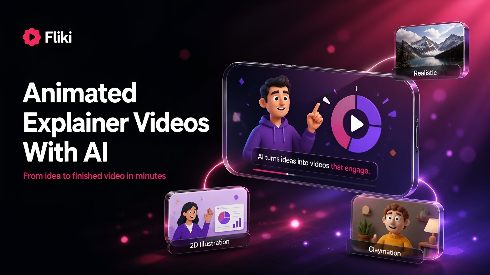
Here is where the "invisible product" problem gets much easier. Fliki has a dedicated Motion graphics explainer video maker built for exactly this, and its standout trick is that it reads your website's brand and can animate your actual UI, so the video looks like your product from the first frame. You can open it directly at app.fliki.ai. The whole setup takes a few minutes, and you can edit every scene afterward.
Step 1: Open the Motion graphics explainer workflow
From the Fliki home screen, open the Motion graphics explainer. You land on a single setup page with your inputs on the left and a live "Your video" summary on the right.

Step 2: Paste your website and describe the video
In the Website field, paste your product URL. Fliki reads your site for its name, colors, fonts, logo, and copy, and designs the video around them, which is how you get a branded result without a designer. Turn on "Animate my website" and it will screenshot your hero and a few sections and animate your real interface inside the design, exactly as it looks, which is the single best way to make a SaaS product concrete on screen. In the optional box, add one line about what the video is for, for example "a 30-second launch teaser for our new analytics dashboard aimed at ops teams."
Step 3: Add your own assets
Under Your assets, attach anything you want featured: product screenshots, your logo, or character images. This is optional, since the website read already pulls your brand, but it helps for specific shots.
Step 4: Choose a motion style
Fliki offers a large grid of motion styles, and for SaaS several are made for you: Blush SaaS, Nebula UI, Corporate flat, Dark monoline, Orbit demo, 2D explainer motion, Glass launch, and Kinetic type, among others. Pick the one that matches your brand and the feeling you want, clean and corporate, bright and playful, or premium and dark.

Step 5: Set duration, format, voice, and brand kit
Set the duration (15, 30, 45, or 60 seconds) and the aspect ratio (16:9 for your homepage and YouTube, 9:16 for social). Pick the video model and resolution, the built-in draft model is fast, and you can switch to a higher-quality model for the final render. Choose an AI narrator (or browse voices), toggle subtitles on for sound-off viewers, and turn on your Brand kit to lock your colors and voice across every scene. The panel shows the exact credit cost up front.

Step 6: Generate
Click Generate video. If you want to check the script and scene plan first, use "Generate plan and review." Most videos render in under five minutes.
Step 7: Edit every scene afterward
You land in an editor where you can refine any scene, swap a visual, adjust a caption, change the voice, or rewrite a line, then export. Because you started with your real brand and UI, the result already looks like your product, and the edits are polish rather than a rebuild.
Real SaaS explainers worth studying
You can learn the whole method from a few well-known examples. The most instructive is Dropbox. Its early demo video walked through the actual use case in plain language, no jargon, seeded on Hacker News and Digg, and it reportedly took the beta waitlist from around 5,000 to 75,000 people in roughly a day. Ignore the mythical "48 million dollars" figure and take the real lesson: showing the genuine workflow solving a real pain, simply, is what moved people.
Slack's animated explainer is a masterclass in the before-and-after contrast, dramatizing the chaos of scattered communication before resolving into a calm, organized workspace, which is how you sell something as intangible as "team communication." Notion opens on a universal pain, information scattered across too many tools, then positions itself as a calm place to focus, outcomes over features. Across all of them the pattern is identical: establish the pain, then show the product doing the job. Treat any specific "it lifted signups by X" claims in studio roundups as marketing lore unless they are independently sourced, since the only well-documented result here is Dropbox's waitlist jump.
Common mistakes that sink SaaS explainers
Feature-dumping. When you explain everything, you explain nothing. One value proposition.
Jargon and over-technical language. Keep the problem statement plain enough for a non-technical buyer.
Showing the tool before the pain. Establish the "before" first, or the reveal lands flat.
Going too long. Past 90 to 120 seconds, completion collapses. Keep heroes to 60 to 90 seconds.
A weak or missing CTA. Impressive visuals then no next step is a wasted video.
Generic stock animation that never shows the real product. For SaaS, abstract stock loses the credibility that animated real UI provides.
Landing-page execution slips. Do not autoplay with sound (browsers block it and it annoys visitors), do add captions since most mobile viewers watch muted, and do not letterbox a horizontal video on mobile or push your CTA below the fold.
What it costs
A custom SaaS explainer from an agency typically runs a few thousand to low five figures, with motion graphics on the more affordable end and 3D on the premium end. An AI tool is a monthly subscription instead, usually somewhere from free to under 100 dollars a month, which is why so many SaaS teams now draft in-house and reserve agency budget for one flagship video. For the full breakdown, see our guide on how much an explainer video costs, and if you are choosing a tool, the best explainer video software roundup compares the options.
The bottom line
A SaaS explainer works when it stops describing software and starts showing an invisible workflow becoming visible. Lead with the job your customer is trying to do, name the pain specifically, show your real product solving it in a couple of steps, land one value proposition, and end with a single clear CTA. Keep the homepage version to 60 to 90 seconds, use motion graphics with your actual UI, and place it above the fold.
The fastest way to get there is to let the tool start from your own brand. You can create your SaaS explainer with Fliki for free, paste your site, animate your real UI, and have a branded first cut in minutes, then spend your energy on the script that makes it convert.