Research reports
The video version nobody has time to not watch
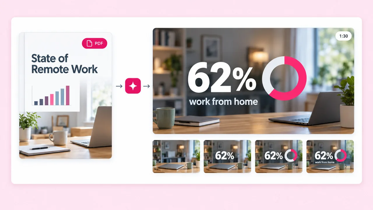
A ninety-second cut of the findings gets more reach than the PDF. Same figures, in the order that makes the argument.
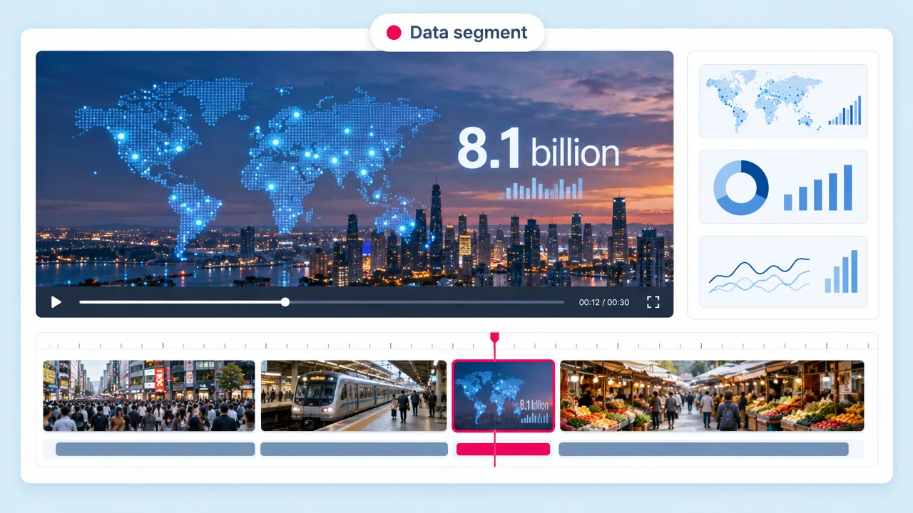
Paste the figures and Fliki builds the chart, then reveals each number in the order the narration explains it. The sequence is the explanation, which is the one thing a static infographic cannot do.
Free forever plan · No credit card required · 80+ languages
Why analysts and marketers pick Fliki
Canva and Piktochart lay numbers out beautifully and then stop. Nothing tells the reader which figure matters or what order to read them in. Narration does, and animation follows it.
Each figure appears when the voiceover reaches it, so the animation carries the argument rather than decorating it.
Paste the figures and Fliki builds the bar, line or comparison. No chart library to configure and no design file to maintain.
Figures count up, bars grow and comparisons resolve, so the viewer sees the change happen instead of reading a final state.
Word-level captions mean the data video still reads on LinkedIn and in a feed, where almost nobody turns the sound on.
16:9 for the report and the deck, 9:16 for the social cut. The layout re-fits per ratio so charts are not cropped in half.
Quarterly figures change. Edit the value and re-render rather than reopening a design file and re-exporting.
Re-voice the same infographic into 80+ languages. The animation timing follows the new read automatically.
Point Fliki at your site and the chart takes your palette and typeface rather than a template’s defaults.
Pull several short data clips out of a single research piece instead of publishing one PDF nobody opens.
How it works
From a set of figures to a narrated, captioned data video.
Paste the numbers and say what they mean, or link the report they came from. Fliki reads the data and the story around it.
Fliki drafts the narration in the order the argument needs, which is what determines when each figure appears on screen.
Choose from 2,000+ voices and point Fliki at your site so the chart uses your palette and typeface.
16:9 for the deck or report, 9:16 for the social cut. Re-voice into other languages from the same project.
Use cases for an animated infographic maker
Reports, results, launches and the LinkedIn post that summarises them.
A ninety-second cut of the findings gets more reach than the PDF. Same figures, in the order that makes the argument.
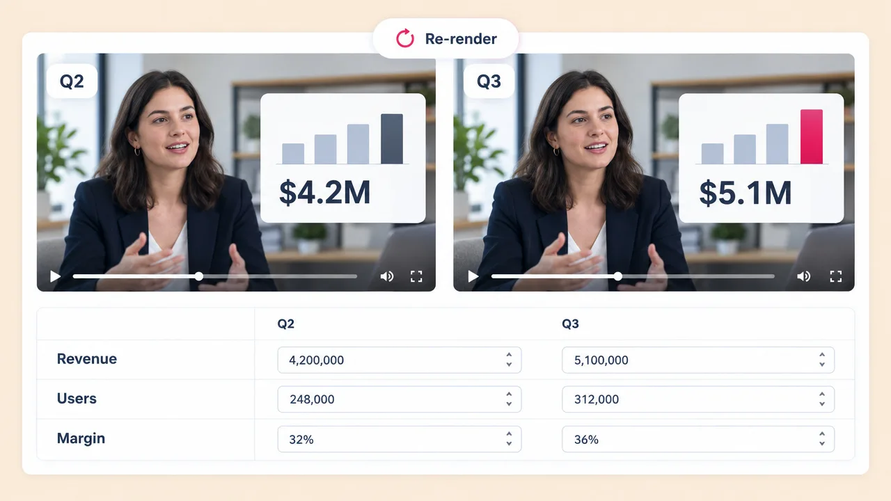
Edit the values and re-render. The format, the narration structure and the brand stay put between quarters.
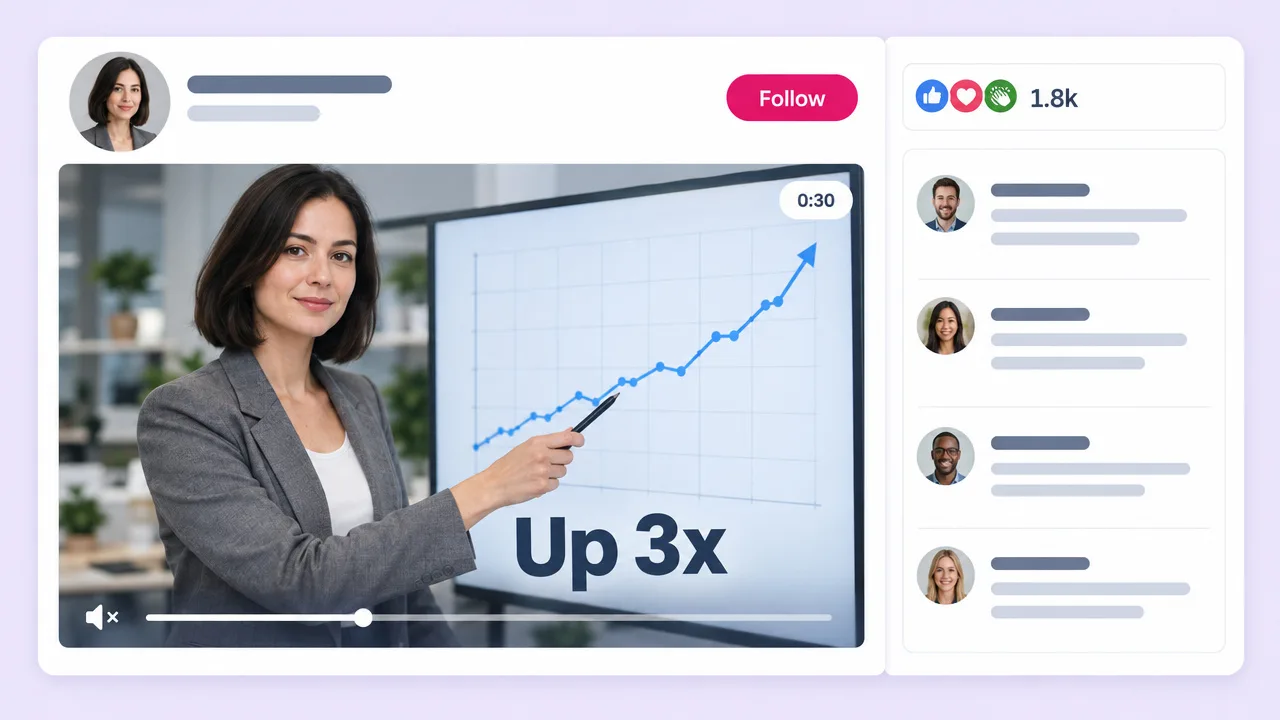
A thirty-second animated chart with captions, sized for the feed. It stops the scroll where a static image does not.
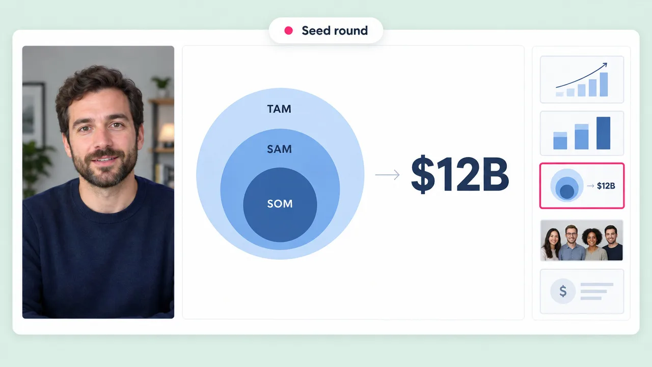
Market size, growth and unit economics revealed as you explain them, instead of a dense slide the room reads ahead of you.
Animated infographic FAQ
What Fliki needs, how it differs from Canva, and what data it can visualise.
Tools
AI video models
Paste the figures and Fliki writes the narration, builds the chart and times one to the other.
Animate some dataFree forever plan · No credit card required · Cancel anytime