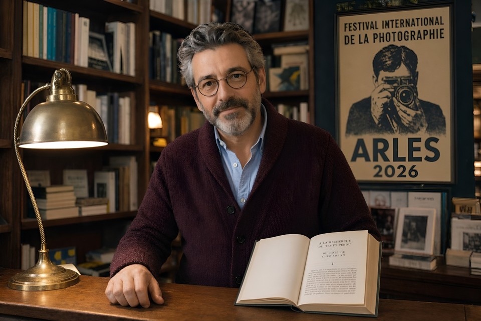
Introduction
If you've ever asked an AI to generate a poster and ended up with something that looked like letters drawn by a toddler who just discovered vowels, you already know the problem every image model has been quietly failing at for three years.
That problem just got solved.
On April 21, 2026, OpenAI shipped GPT Image 2 (the model powering ChatGPT Images 2.0), and within twelve hours it had done something no image model has ever done: it took the #1 spot across every category on the Image Arena leaderboard with a +242 Elo lead on text-to-image, the largest gap ever recorded there. For context, the previous record gap on that leaderboard was under 100 points. This wasn't a marginal upgrade. It was a step change.
In this article, I'll walk you through exactly what GPT Image 2 is, what makes it different from anything you've used before, how to actually prompt it well, where it still falls short, and how you can try it today (including inside Fliki, where we've already rolled it out for paid users).
What Is GPT Image 2?
GPT Image 2, officially called gpt-image-2 in the API, is OpenAI's third-generation flagship image generation model. It succeeds GPT Image 1 (launched March 2025) and GPT Image 1.5 (December 2025), and it is available via the OpenAI API under the model name gpt-image-2 and is OpenAI's first image model with native reasoning capabilities built into the architecture.
The two claims OpenAI is making with this release are bold, and they're both backed by benchmarks:
Roughly 99% text rendering accuracy across Latin, Chinese, Japanese, Korean, Hindi, Arabic, and Bengali scripts.
A reasoning layer that researches, plans, and even searches the web before rendering a single pixel.
If you've been using DALL-E 3, Midjourney, Stable Diffusion, or GPT Image 1.5 up to now, the practical difference is going to feel significant. Let me explain why.
What Actually Changed (And Why It Matters)
1. Text inside images actually reads correctly
This is the single biggest practical upgrade, and it's the one that unlocks dozens of workflows that were previously impossible with AI.
Previous image models treated text as decoration. You'd prompt for a poster with a headline, and you'd get something that looked like a headline from across the room but turned into alphabet soup on a closer look. GPT Image 2 achieves around 99% character-level text accuracy across Latin, CJK, Hindi, and Bengali scripts, and it handles mixed-script layouts like a Japanese poster with Latin product names, or a Chinese title layered over English subtitles.
If you build menus, infographics, product packaging, UI mockups, social graphics with copy, book covers, or localized ad creative, this is the feature you've been waiting for.
2. It thinks before it generates
This is the architectural shift that separates GPT Image 2 from every image model that came before it. When a user selects a "Thinking" model within ChatGPT, the system researches, plans, and reasons through the structure of an image before the first pixel is rendered.
In practical terms: you ask for an infographic about tomorrow's weather in San Francisco, and the model checks the actual forecast, decides what activities fit that weather, then composes a layout around the data. You prompt for a magazine cover with a "Display until" barcode, and the rendered barcode uses a plausible date and format instead of nonsense digits.
Thinking mode is only available to ChatGPT Plus, Pro, and Business users, with up to eight consistent images generated at once from a single prompt. Instant mode is the faster, default path for everyday prompts and remains strong on its own.
3. Dense scenes don't fall apart
Ask an older image model for "a bedroom with 30 objects" and it would skip items, duplicate them, or hallucinate extras until the scene looked like a fever dream. GPT Image 2 holds the count. In one viral community test, someone asked it for a scene with 100 distinct elements, and the model not only rendered all 100 but also labeled each one inside the same image.
For anyone making inventory visuals, complex infographics, wireframes with many UI elements, or editorial illustrations with lots of characters, this matters a lot.
4. Editing actually preserves what you didn't ask to change
The old pattern with AI image editing was depressing: ask to swap a jacket color, and the face would subtly morph into a different person. Remove one person from a group shot, and the entire composition would shift.
Original image:
Edited image:
GPT Image 2 introduces context-aware multi-turn editing. You can tell ChatGPT to "change the background to sunset," "remove the person on the left," or "make the headline larger," and it preserves everything else. Face preservation is explicitly improved, so you can change a subject's clothing, pose, or background without accidentally getting a stranger back.
5. It handles any style without the generic "AI look"
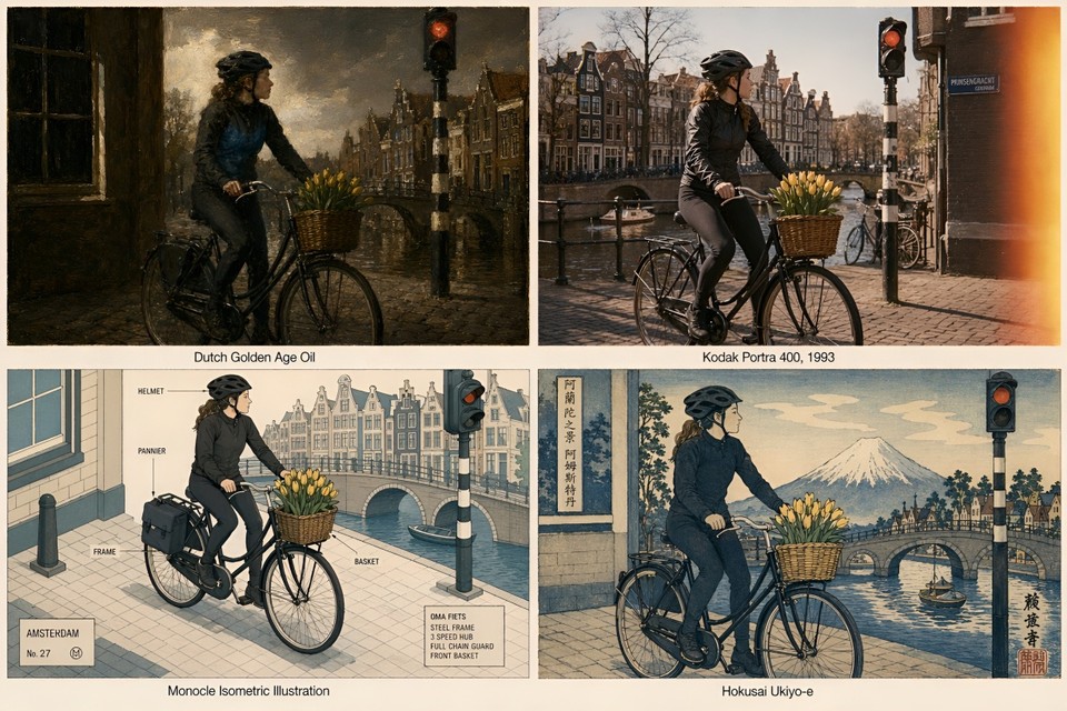
Previous models had a home style. Midjourney leaned painterly. DALL-E leaned generic flexibility. GPT Image 2 is what OpenAI describes as a visual polyglot: pixel art, manga, film stills, watercolor, editorial magazine covers, technical diagrams, hand-drawn recipe cards, architectural renders. It handles each faithfully instead of forcing a house aesthetic.
Pair this with the reasoning layer and the multilingual text support, and you get a model that's genuinely built for production content pipelines, not just vibey experimentation.
How to Access GPT Image 2 Today
There are four paths right now:
ChatGPT: Available globally to Free, Plus, Pro, Business, Enterprise, and Codex users, with Thinking mode exclusive to paid tiers. Head to the image creator inside ChatGPT.
OpenAI API: The gpt-image-2 endpoint is rolling out to developers in early May 2026.
Third-party integrations: Figma, Canva, Adobe Firefly, fal.ai, and others are integrating it.
Fliki: We've made GPT Image 2 live inside Fliki for paid users, so you can generate with it directly inside the editor alongside every other model we support (Seedream, Nano Banana, Veo, and more). If you want to try it without juggling an API key or a separate ChatGPT subscription, just head to our AI image generator and pick it from the model list.
If you're curious about pricing at the API level, it follows token-based pricing of $8 per million input tokens, $2 for cached inputs, $30 per million output tokens for images, and $10 per million text output tokens, which lands most real-world generations between roughly $0.04 and $0.35 per image depending on complexity and resolution.
It's also worth knowing that DALL-E 2 and DALL-E 3 are being deprecated and retired on May 12, 2026, with gpt-image-2 replacing them as the default image model across ChatGPT and the OpenAI API. If any of your existing pipelines still call the legacy DALL-E endpoints, plan the migration now.
High-Quality Prompt Examples You Can Copy and Test
The biggest thing to understand about prompting GPT Image 2 is that the reasoning layer means you can write in full natural sentences instead of keyword chains. Structure still helps, though. The formula that consistently works in testing is:
[Style/Medium] + [Subject] + [Environment/Setting] + [Lighting] + [Composition] + [Text/Technical specs]
Here are six prompts that showcase what this model can actually do. Attach the outputs to each example when you publish; they'll do more to convince readers than any benchmark claim.
Showcase 1: Editorial magazine cover with complex typography
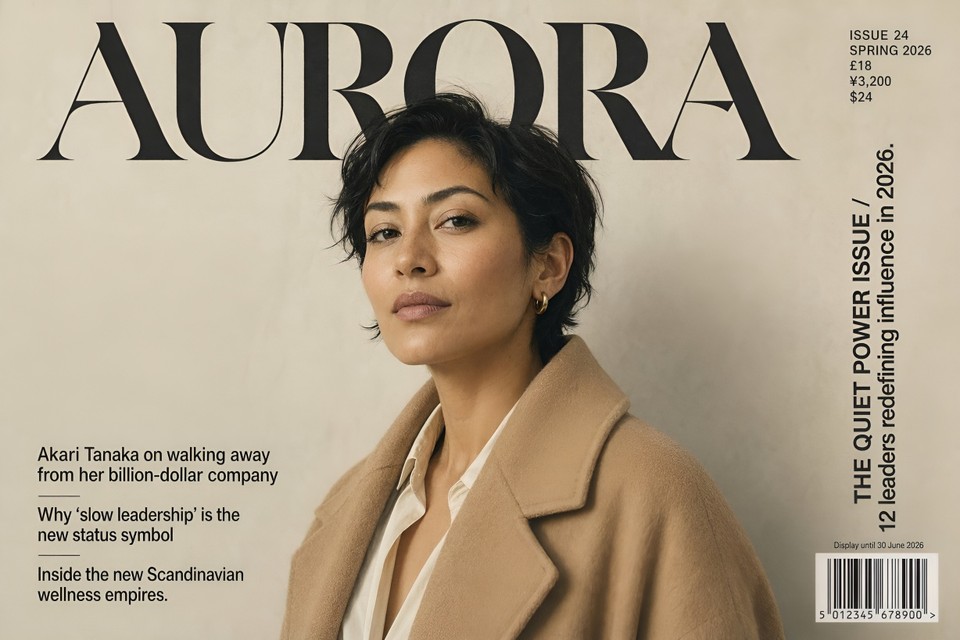
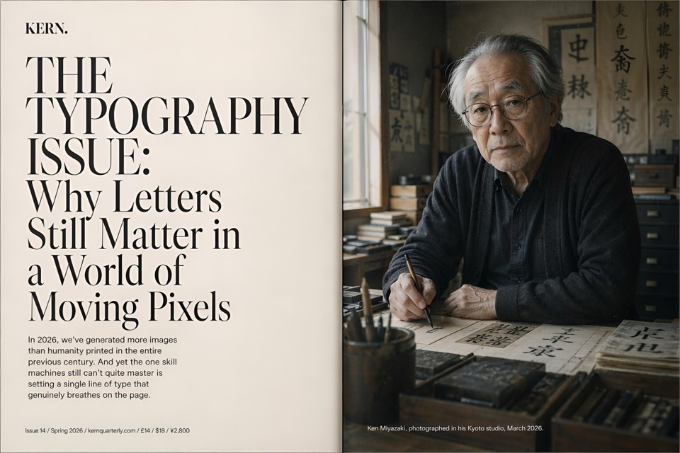
Full-bleed cover of a fictional premium fashion and culture quarterly titled "AURORA," positioned visually somewhere between Dazed, The Gentlewoman, and a Japanese culture magazine like Popeye. Masthead "AURORA" set in a custom high-contrast display serif reminiscent of Canela Deck but with sharper terminals, 180pt, tracked-tight, top-aligned, deep black on warm cream paper. To the right of the masthead, a small metadata block in 14pt uppercase grotesque reads "ISSUE 24 / SPRING 2026 / £18 / ¥3,200 / $24." Vertical right-edge cover line in 32pt set in two lines: "THE QUIET POWER ISSUE / 12 leaders redefining influence in 2026." Three bottom-left secondary cover lines stacked in 18pt: "Akari Tanaka on walking away from her billion-dollar company" / "Why 'slow leadership' is the new status symbol" / "Inside the new Scandinavian wellness empires." Cover subject is a 38-year-old woman of mixed South Asian and Scandinavian heritage, three-quarter portrait, wearing an oversized camel-colored wool coat over a cream silk blouse, cropped dark hair, calm direct gaze into camera. Soft north-facing natural window light, warm neutral skin tone, subtle film grain, shot as if on a Pentax 67 with a 105mm at f/2.8 on a hand-painted matte grey paper backdrop. Bottom-right corner has a clean EAN-13 barcode reading "5 012345 678900" with "Display until 30 June 2026" printed above it in 9pt. Paper stock feels matte uncoated, printed in CMYK with a subtle warm grey spot ink. Vertical 4:5 ratio, 2K resolution, shot as a flat cover scan.
Showcase 2: Multilingual restaurant menu
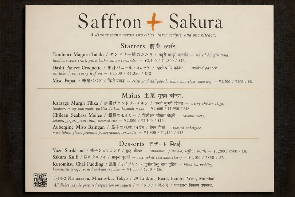
A single-page printable dinner menu for a fictional Tokyo and Mumbai fusion restaurant called "Saffron + Sakura," designed to feel like a Kinfolk spread crossed with an Aesop in-store printed card. Paper is warm cream uncoated 180gsm with a faint linen texture. At the top, a hand-set logotype "Saffron + Sakura" in a bespoke serif with the "+" rendered as a single hand-painted brush stroke in saffron orange (#E87722). Directly below, a one-line tagline in 11pt italic reading "A dinner menu across two cities, three scripts, and one kitchen." The body of the menu is three stacked sections, each with a trilingual header and three dishes.
Section 1 header: "Starters 前菜 स्टार्टर." Dishes:
"Tandoori Maguro Tataki / タンドリー鮪のたたき / तंदूरी मागुरो तातकी — seared bluefin tuna, tandoori spice crust, yuzu kosho, micro coriander — ¥2,400 / ₹1,800 / £16."
"Dashi Paneer Croquette / 出汁パニール・コロッケ / दाशी पनीर क्रोकेट — smoked paneer, shiitake dashi, curry leaf oil — ¥1,800 / ₹1,350 / £12."
"Miso Papad / 味噌パパド / मिसो पापड़ — crisp urad dal papad, white miso glaze, shiso leaf — ¥1,200 / ₹900 / £8."
Section 2 header: "Mains 主菜 मुख्य व्यंजन." Three dishes following the exact same trilingual structure, realistic prices in all three currencies.
Section 3 header: "Desserts デザート मिठाई." Three dishes, same trilingual pattern.
Thin gold-foil hairline dividers between sections. Footer: a small plausibly scannable QR code on the left, a two-city address line reading "3-14-2 Nishiazabu, Minato-ku, Tokyo / 29 Linking Road, Bandra West, Mumbai," and a closing trilingual note "All dishes may be prepared vegetarian on request / ベジタリアン対応可 / शाकाहारी विकल्प उपलब्ध." Flat top-down scan style, soft shadow at the corners as if the menu were lying on a dark linen tablecloth. 2K resolution.
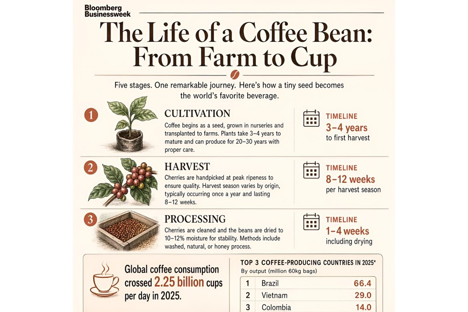
Showcase 3: Scientifically accurate explainer infographic

A magazine-quality explainer infographic titled "How Photosynthesis Actually Works," aimed at a curious 14-year-old, in the visual style of a Scientific American illustrated feature. Single vertical 9:16 layout, divided into five numbered stages stacked top to bottom, connected by a thin hairline flow line.
Stage 1: "Light Absorption" — cross-section illustration of a leaf with a zoomed detail of a chloroplast, clearly labeled thylakoid, stroma, and granum.
Stage 2: "Water Splitting (Photolysis)" — water molecules breaking into oxygen, protons, and electrons, with the chemical equation "2H₂O → 4H⁺ + 4e⁻ + O₂" rendered cleanly and correctly.
Stage 3: "The Calvin Cycle" — a circular process diagram showing CO₂ entering, the three phases (carbon fixation, reduction, regeneration of RuBP) labeled in correct order, glucose exiting at the bottom.
Stage 4: "Glucose Production and Transport" — illustration of sugar moving out of the chloroplast toward the rest of the plant.
Stage 5: "Oxygen Release" — oxygen molecules exiting through stomata on the leaf underside.
Each stage gets a two-to-three sentence grade-appropriate explanation in clean typography. Color palette: soft sage green background (#E8EFE4), forest green section dividers, buttery yellow sunlight rays in stage 1, ivory callout boxes with deep charcoal 11pt body text. Headline set in a friendly geometric sans similar to GT Walsheim in 48pt, body in a readable humanist sans like Söhne in 11pt with 1.5 line height. Bottom of the page: a tiny credit line reading "Illustration reviewed against standard high-school biology curriculum, 2026." Every scientific label, equation, and arrow direction must be factually correct.
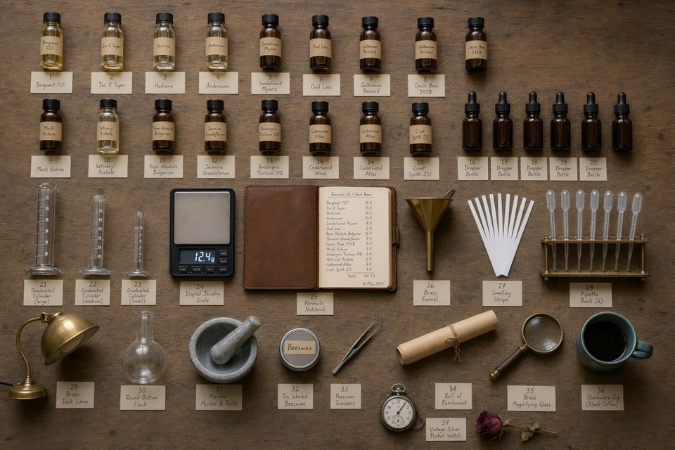
Showcase 4: The 60-object dense scene test
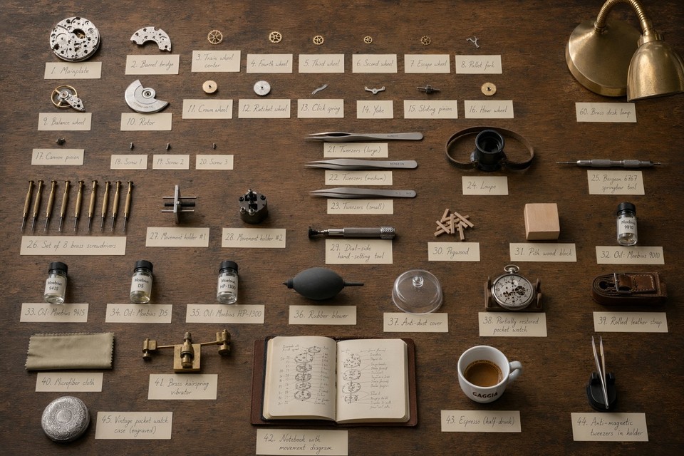
A straight-down overhead photograph of a vintage watchmaker's workbench, shot as if for a Monocle craftsmanship feature. Rough aged oak bench surface, soft north-facing studio daylight, warm shadows, shallow shadow falloff, medium-format editorial aesthetic.
Arrange exactly 60 distinct objects with clear breathing room between each: one fully disassembled ETA 2824 automatic movement laid out plate-up in its individual components (mainplate, barrel bridge, train wheels, pallet fork, balance wheel, escape wheel, rotor, crown wheel, ratchet wheel, click spring, yoke, sliding pinion, hour wheel, cannon pinion, and three screws separated out, count as 16 components); three precision tweezers of different sizes; a jeweler's loupe on a leather strap; a Bergeon 6767 springbar tool; a set of 8 brass screwdrivers in graduated sizes; two movement holders; a dial-side hand-setting tool; a small pile of pegwood; a pith wood block; four small glass vials of watch oil labeled "Moebius 9010," "Moebius 9415," "Moebius D5," and "Moebius HP-1300"; a soft rubber blower; an anti-dust cover; a partially restored pocket watch in a cradle; a rolled vintage leather strap; a folded microfiber cloth; a brass hairspring vibrator; a small leather notebook open to a hand-drawn movement diagram; a half-drunk espresso in a small white Gaggia cup; a brass desk lamp with a flexible arm; a pair of anti-magnetic tweezers in a holder; and one vintage silver pocket watch case laid face-down to show its engraving.
Beside every single object, place a small cream-colored hand-numbered index card from 1 to 60 with the object's name written in pencil in a legible cursive hand. Sharp focus throughout the scene, warm documentary lighting, 2K resolution, shot as if on a Phase One XT at f/11.
Showcase 5: Multi-turn editing preservation
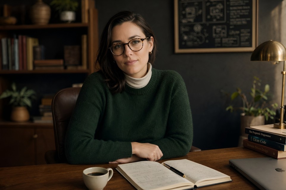
Round 1: A studio editorial portrait of a 32-year-old female software architect sitting at a mid-century walnut desk in a warmly lit home office. She has shoulder-length dark brown hair pulled loosely behind one ear, tortoiseshell round glasses, wearing a forest-green crew-neck wool sweater over a cream turtleneck. Warm late-afternoon key light streams from camera-right through a diffusion scrim, cool fill from camera-left, backdrop is a dark charcoal textured wall. An open leather-bound notebook, a fountain pen, and a small ceramic cup of black coffee sit on the desk in front of her. Shot on a Sony A7R V with an 85mm f/1.4 lens at f/2, tack sharp on the eyes, natural skin texture with fine pores visible, shallow depth of field, editorial magazine aesthetic, warm amber and deep green color palette, subtle film grain, 2K resolution.
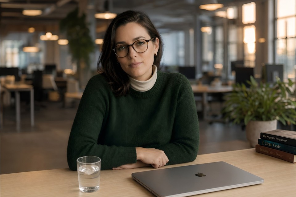
Round 2: Keep her face, hair, glasses, sweater, turtleneck, and pose exactly identical, down to every strand of hair. Change only the following: swap the walnut desk for a minimalist light oak standing desk; replace the leather notebook and fountain pen with a closed 16-inch silver MacBook Pro; swap the ceramic coffee cup for a clear glass of water with a single ice cube; change the charcoal backdrop to a softly blurred open-plan office background at golden hour with warm bokeh highlights from overhead pendant lights and distant monitors; shift the overall lighting slightly cooler and more diffuse to match the new environment. Her identity, facial features, skin texture, and the exact cut and color of her sweater must not change in any way.
Showcase 6: Hyper-detailed app UI mockup
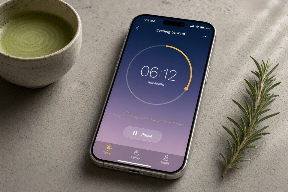
A photorealistic product render of an iPhone 17 Pro in Natural Titanium finish, lying perfectly flat on a textured matte concrete surface beside a small handmade ceramic cup of whisked matcha (visible bamboo chasen tines have just left fine concentric circles on the surface) and a fresh sprig of rosemary. The phone screen displays the active session screen of a fictional meditation app called "Stillness." Render the screen contents in precise, readable detail:
iOS status bar at the top: time reads "7:14 AM," full signal bars, active WiFi icon, battery indicator at 87%.
App background: a vertical gradient from deep indigo (#1B2A4E) at the top to dusky lavender (#C8A2C8) at the bottom.
Top navigation bar: a small back chevron on the left, centered title "Evening Unwind" in SF Pro Display Semibold 17pt, and a three-dot menu icon on the right.
Main canvas: a large 220pt circular progress timer ring in pale gold (#D4AF37), filled clockwise to approximately 38%, center text "06:12" rendered in SF Pro Rounded Light 72pt with "remaining" below it in 13pt.
Below the ring: a subtle animated waveform line in pale gold, and a frosted-glass "Pause" pill button with a white pause glyph.
Bottom tab bar: three icons with labels in SF Pro 10pt, reading "Today" (selected, gold-filled SF Symbol), "Library," and "Profile."
Phone is angled five degrees clockwise on the concrete surface, soft directional window light from the top-right creating a gentle highlight along the titanium side-frame and a subtle reflection on the screen glass, a single shadow trailing to the lower-left. Shot as if on a Sony A7R V with a 90mm macro lens at f/4, ISO 100, tack sharp on the screen content, natural shallow depth of field softening the rosemary and matcha cup. Styled product photography in the visual language of Apple's own press renders, 2K resolution.
The difference between GPT Image 2 and anything else you've used becomes obvious the moment you try the text-heavy ones.
Where GPT Image 2 Still Falls Short
I'd be doing you a disservice if I pretended this was a complete win across every dimension. It isn't.
Exact counts are unreliable. Ask for "exactly 17 oranges" and you might get 15 or 19. The model drafts at a conceptual level rather than running an explicit counting pass.
Brand logo reproduction is hit or miss in early testing, especially for recent brand refreshes.
Style control is less granular than Midjourney for things like film stock, lens type, or grain texture.
Content policy is stricter than open-source alternatives. Certain creative prompts that work fine on Stable Diffusion will be declined here.
The knowledge cutoff is December 2025, so cultural references, product launches, or news events after that date may render inaccurately.
None of these are deal-breakers for most workflows, but they're worth knowing before you migrate a production pipeline.
Who Should Use GPT Image 2 Right Now
If you make any of the following, this model is now the obvious default:
Marketing graphics with copy (headlines, CTAs, multilingual variants)
Infographics, diagrams, and educational content
Product and packaging mockups
UI screenshots for pitch decks and landing pages
Editorial covers, book covers, and poster design
Social media carousels where text readability matters
Multi-panel comics, children's books, or storyboards with character continuity
For pure painterly illustration or precise cinematic style control, Midjourney V8 is still a strong choice. For everything else, GPT Image 2 is probably already the right tool. Independent coverage from TechCrunch and VentureBeat reaches the same conclusion on launch day, and OpenAI's own announcement post has the full feature rundown if you want to go deeper.
Try It Today on Fliki
Here's the simplest way to put all of this into practice. Inside Fliki, GPT Image 2 is already live for paid users. You can generate images with it directly, then animate them into video clips using our image-to-video AI, layer in voiceovers and captions using our text-to-video generator, and ship a finished piece of content without ever leaving the editor.
That end-to-end workflow, from prompt to finished video, is exactly why a single stronger image model matters so much. Better text rendering means better thumbnails, better ad creatives, better slide visuals, better everything downstream. If you want to see the full feature lineup, take a look at our complete feature list or jump straight into generating with Fliki's AI image generator.
GPT Image 2 is the first image model that genuinely feels built for production. The benchmarks back that up, the prompts above will show you in under five minutes, and the deprecation of DALL-E 3 next month makes the shift pretty much inevitable anyway.
The only real question left is what you're going to make with it.